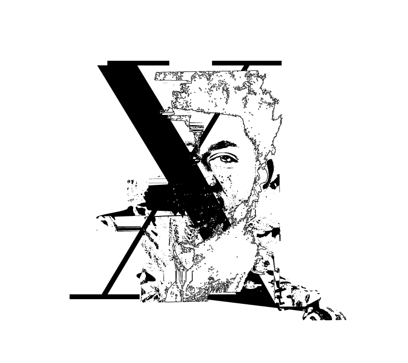
ZACH PEARL

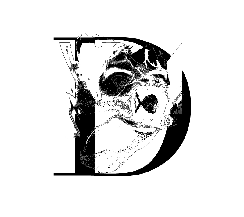
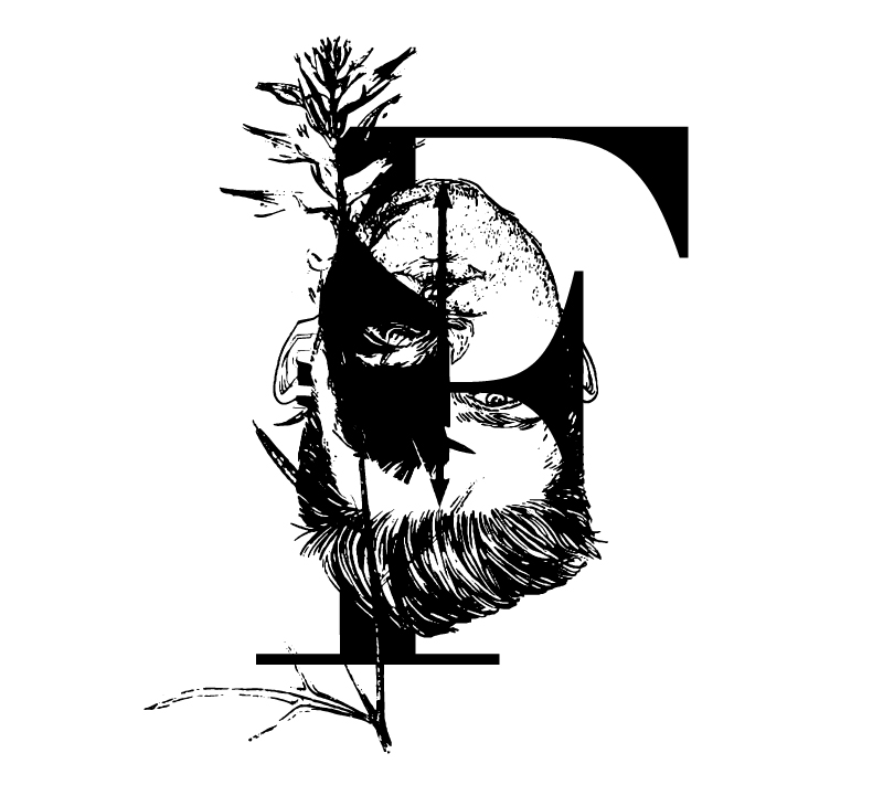
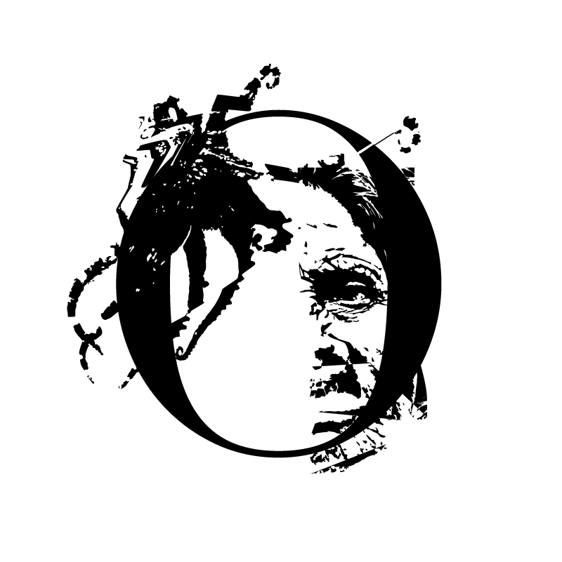
Facetype: A Font for Cyberfeminists
Year: 2022
Clients: N/A [Academic]
Format: Oversize black and white prints (18 x 18 in.); digital font package (forthcoming)
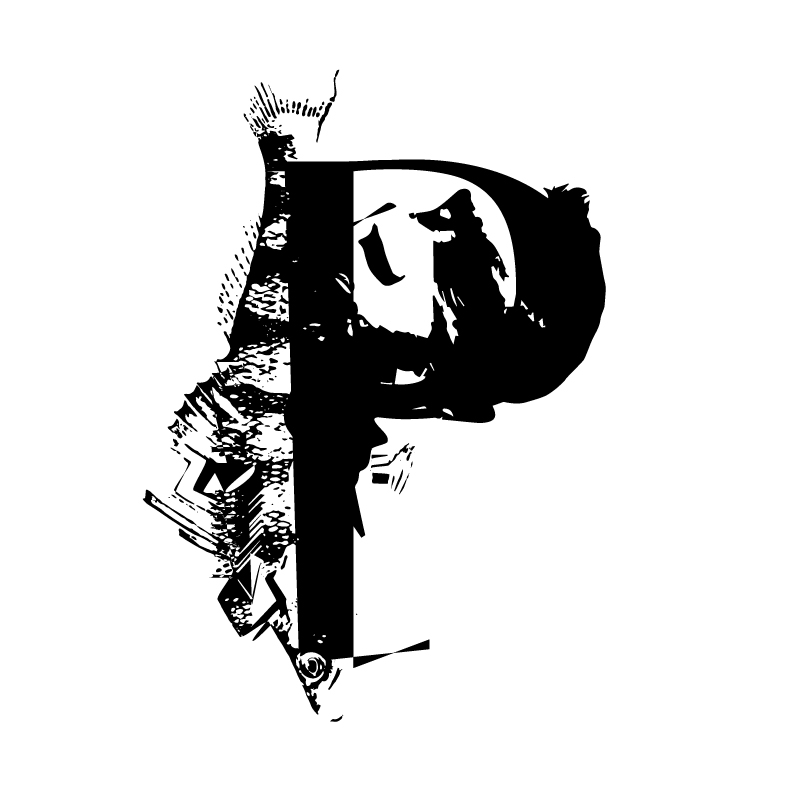
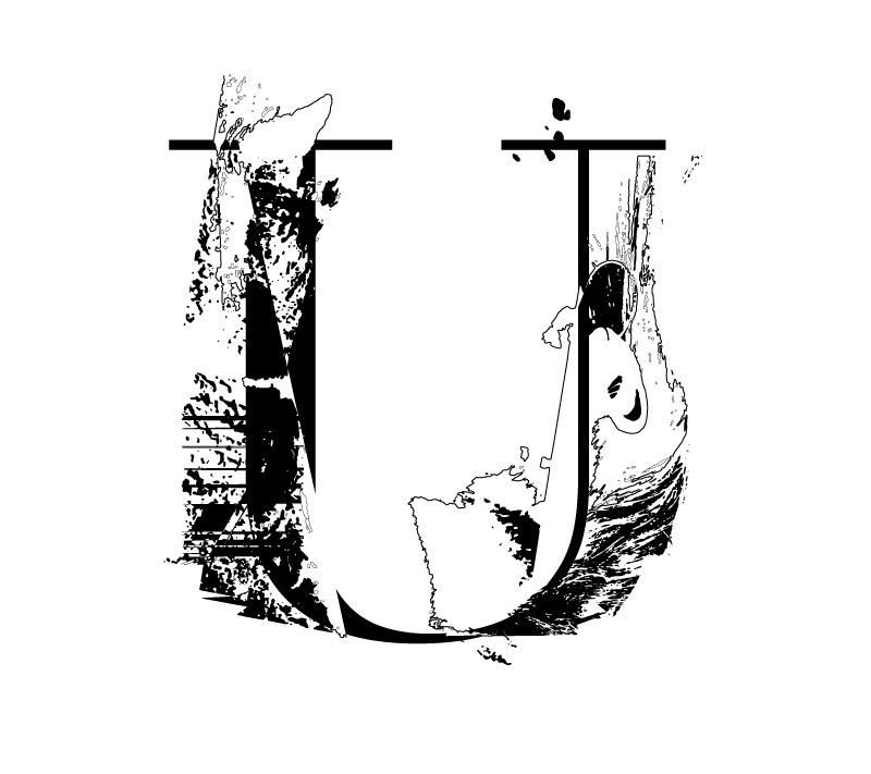
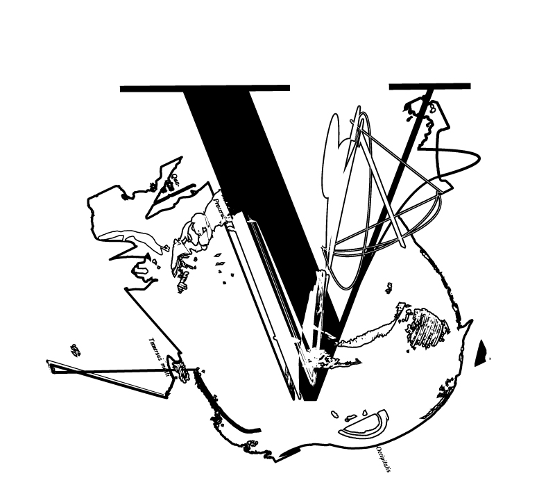
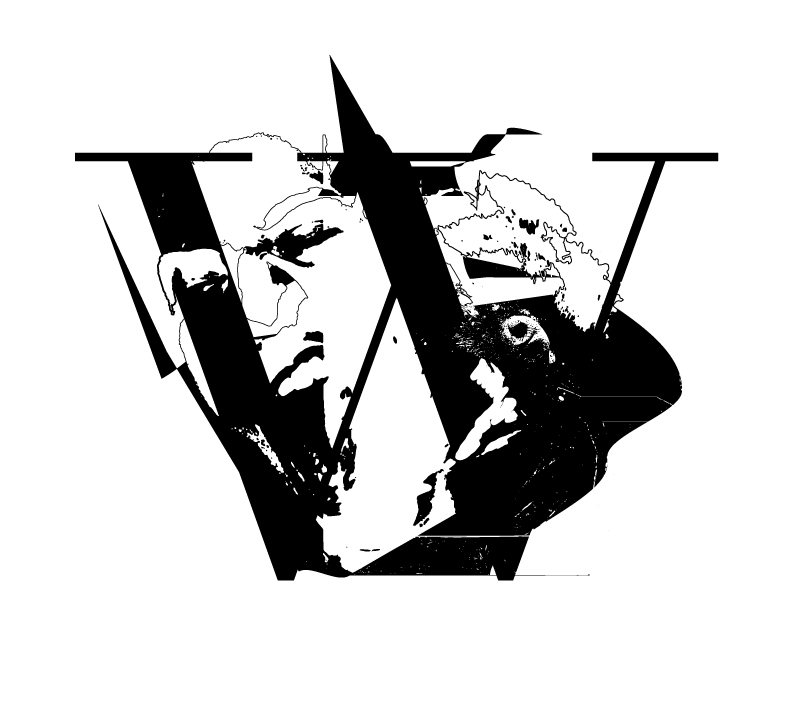
This is a research-creation project that initially stemmed from a series of type experiments I produced when revising an assignment for my own graphic design students. In designing this font, I combine algorithmic logic and automated computer processes with cyberfeminist theory to tactically disrupt and reconstruct the modernist humanist typeface Didot. Originally drafted in the late 1700s, Didot represents the aesthetic of the Englightenment and arguably the aspirations of European culture. Through a processural vocabulary of splices, shifts, inversions and interruptions, I create assemblages of typography, human faces and non-human entities such as animals, plants and fungi. What results are formal experiments in moving beyond an aesthetic of modernist humanism towards one of posthumanism and letteral communication that involves the visual breakdown of binarisms so fundamental to the rhetorics of Western science and technological progress.


CRITICAL PATCH: Ideas Digital Forum 2018 Publication
Year: 2019
Clients: KAPSULA Magazine in partnership with The Robert McLaughlin Gallery (RMG) & Ontario Association of Art Galleries (OAAG)
Format: Interactive PDF
This publication was the result of a year-long partnership between KAPSULA Magazine, RMG and OAAG to somehow document the 2-day Ideas Digital Forum that took place in late October 2018 in Oshawa, Ontario. Because The RMG was already producing a digital toolkit as part of the forum, so the approach to this publication became less about pure documentation of the event and more about capturing provocations and ongoing questions in the aftermath of the forum. In particular, the idea of "patching" or the temporary fix of a computer system that, while still functional, is in need of a major update. In this case, the update is the call for museums and art galleries to better align their mandates with digital practices.
This document is interactive, containing hyperlinks, rollover images, and hidden captions and notes. To access the interactive content you will need to
download the PDF, and open it in either Adobe Acrobat X+ or Adobe Reader DC.
BORN DIGITAL Publication
Year: 2018
Client(s): KAPSULA Magazine & InterAccess Electronic Media Arts Centre
Format: Interactive PDF
Published through KAPSULA PRESS in partnership with InterAccess, this special edition of the arts writing magazine offers a critical response to the 2018 Vector Festival—an annual showcase of game art and emergent digital media held in various locations across Toronto.
This document is interactive, containing hyperlinks, rollover images, and hidden captions and notes. To access the interactive content you will need to
download the PDF, and open it in either Adobe Acrobat X+ or Adobe Reader DC.
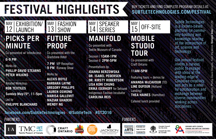
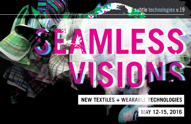
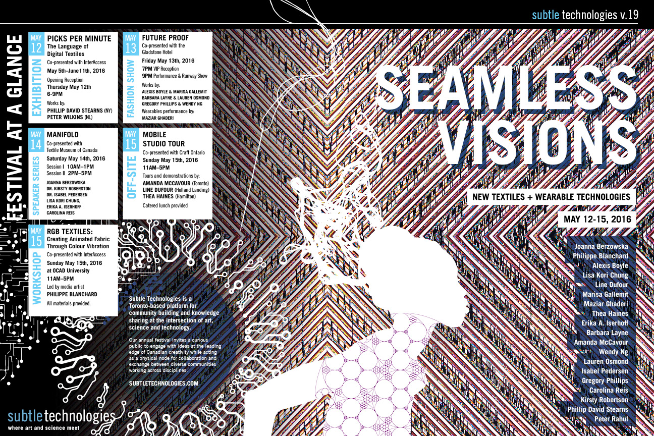
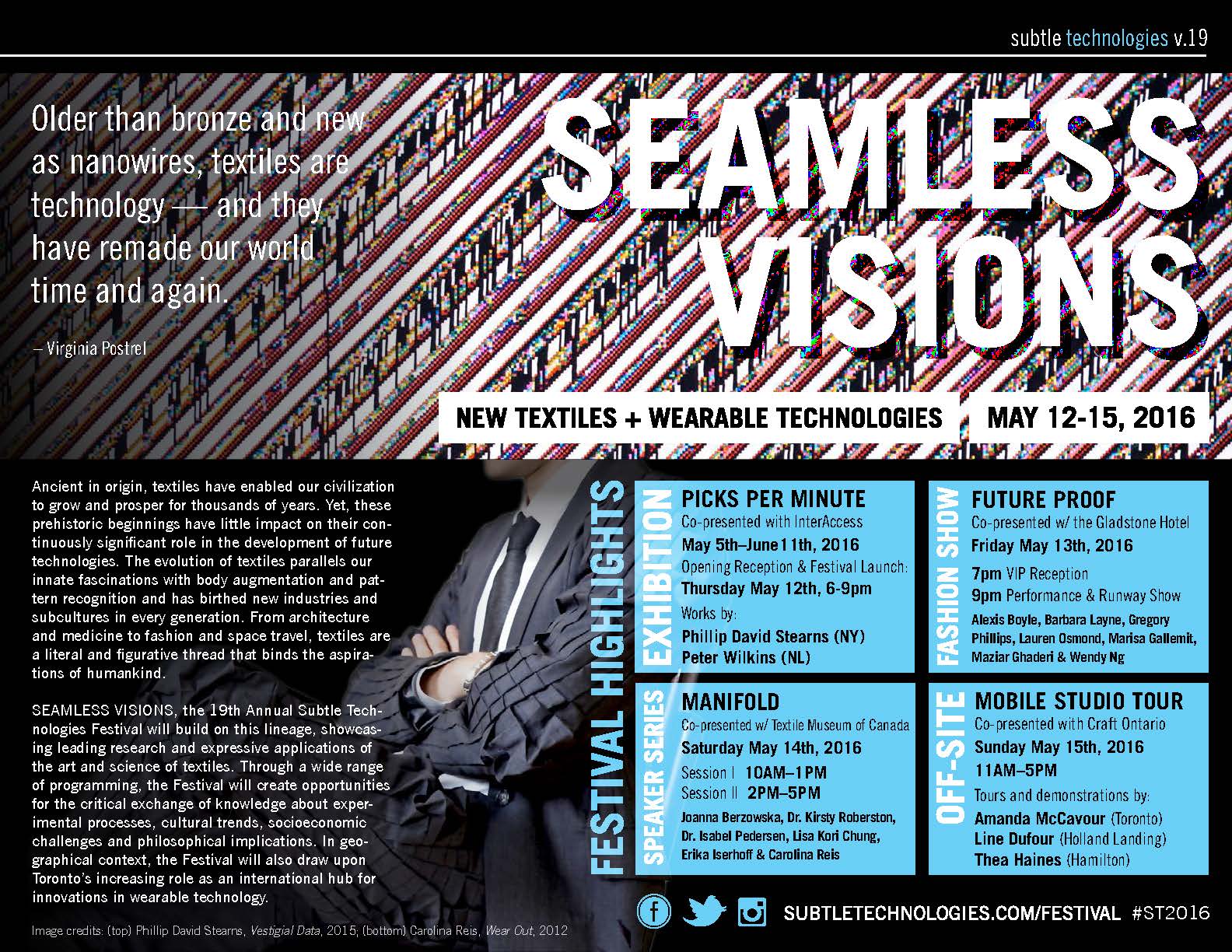
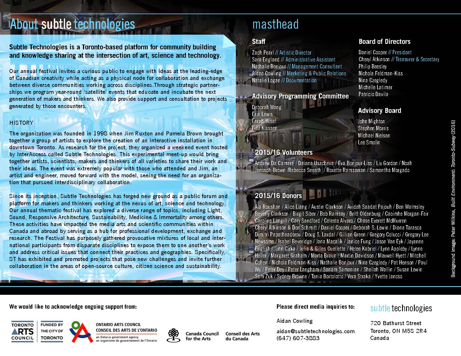
Subtle Technologies v.19 Marketing Materials
Year: 2016
Client: Subtle Technologies
Formats: Postcard; printed program; digital press kit
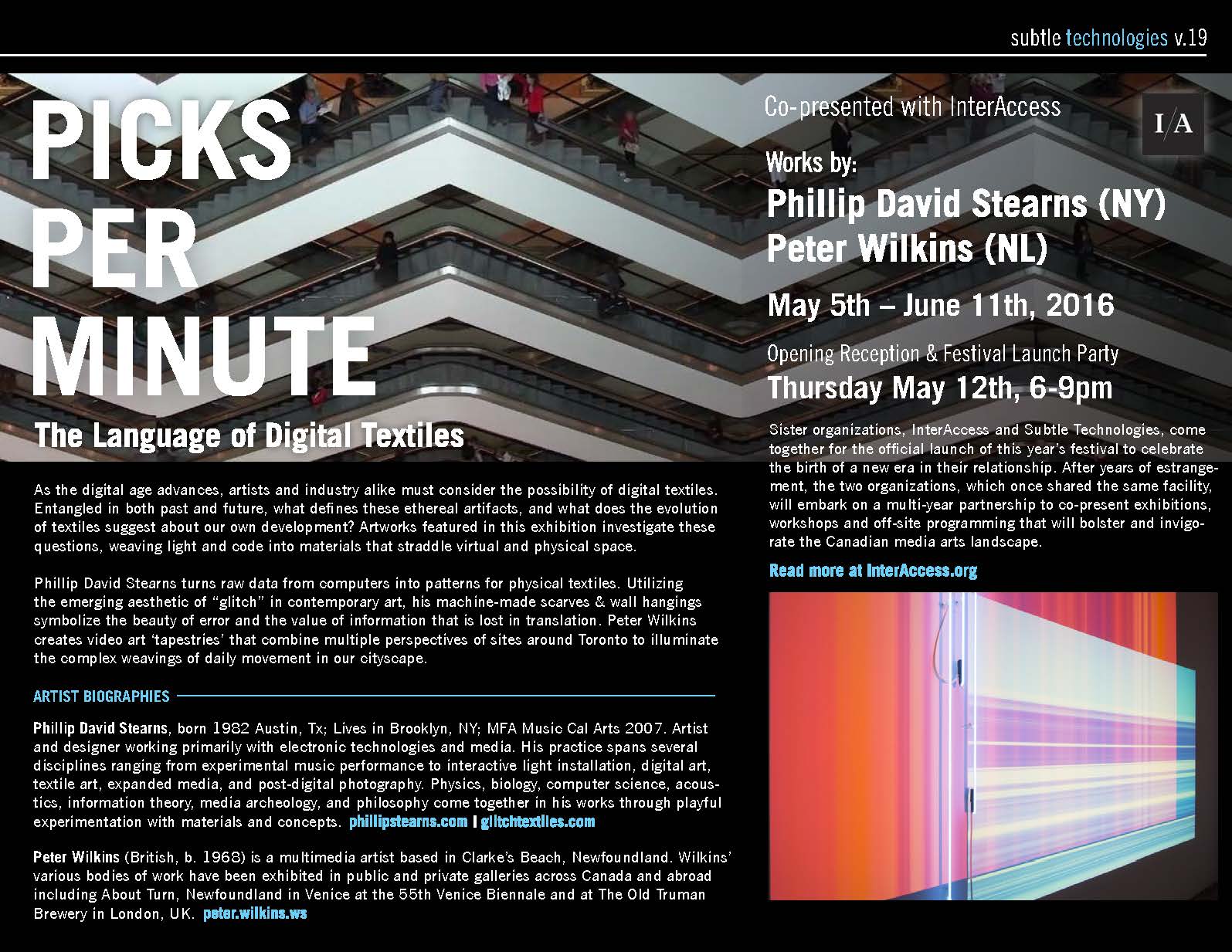
During my three-year tenure as Artistic Director of the Subtle Technologies Festival, I also acted as the designer for all print and web marketing materials. For the 19th edition of the Festival, events explored the future of textiles and wearable technologies, and I wanted to emphasize the relationship between patterns in textiles and the patterned nature of coding languages that construct and power our technosocial environment. I chose to work with a detail view of a piece by an artist in the Festival's exhibition, Phillip David Stearn. His series Vestigial Data (2015) used 'found' data from discarded hard drives as raw material to input into a Jacquard loom, which then produced textiles that visualized the patterns in the found data. Used in everything but the Web banner, Stearn's piece was an important departure point as it determined colour palette and typographic 'feel' through its geometric and grainy aesthetic.
Postcard design (front and back):

Web banner—to be used in social media posts and e-newsletters:
This is the cover for the oversized printed program, which could be detached and displayed as a poster (12 x 18 inches)
To get a discount on the print job, all the programs had to be folded and collated individually...

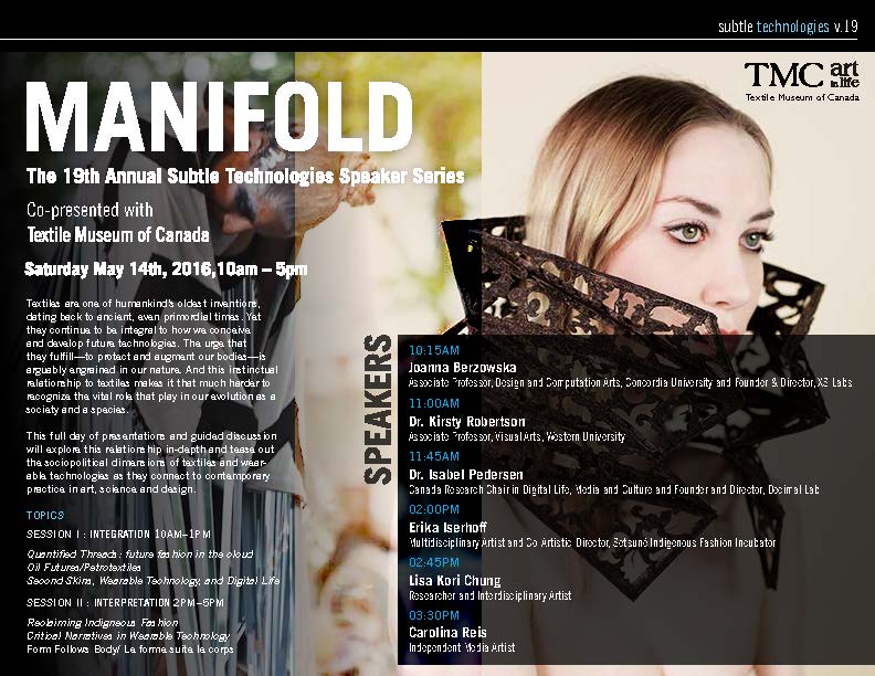
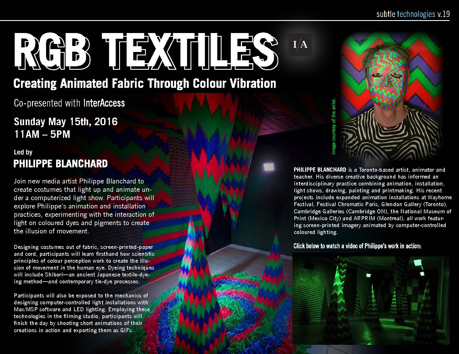
This particular version of the festival also had a strong PR dimension, with a dedicated publicist, so a formal digital press kit was developed. The document was designed in a 'modular' fashion that so that each event was confined to a single page, making it easy to extract and used for targeted send outs:


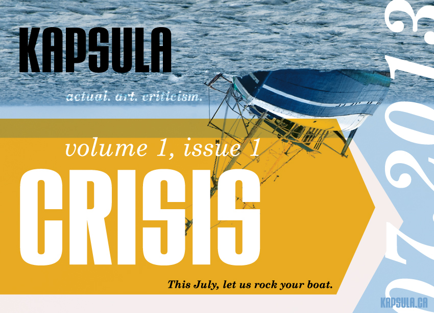
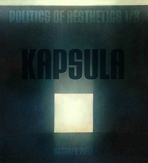
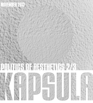
KAPSULA Magazine Identity
Year: 2013-14
Client: KAPSULA Magazine
Formats: Print and Web-ready graphics
KAPSULA Magazine ran for three volumes from 2013-2017, and was an imprint of KAPSULA PRESS of which I am a co-founder and the Managing Editor. KAPSULA Magazine was a monthly online art criticism and culture writing publication that meshed an analog and digital publication model. Able to move faster than print pubilcations, the magazine published an average of 13 times per year and partnered with art galleries and academic institutions to deliver special issues on salient topics.
The logo and identity are meant to convey an uncompromising and bold aesthetic with nods to Constructivism and Soviet era propaganda posters.
Initial 2-colour logo (2013-14):
Updated 2-colour logo and B/W version (2015-present):
Logo variation for the monthly newsletter:
Web advertisement for the inaugural issue:
Adaptation of the graphic mark within the magazine:

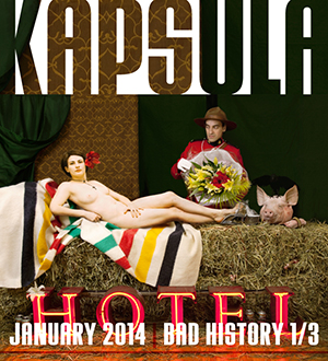
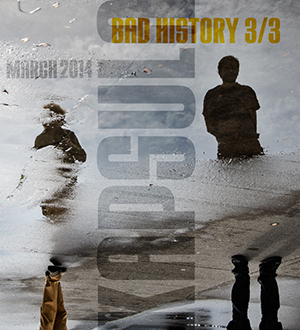
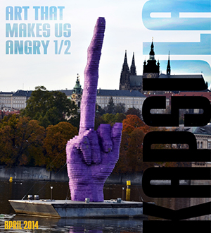
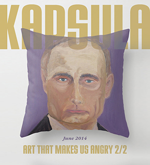
Select covers of the Magazine from its first year of production:
KATHERINEDENNIS.ca Identity & Website
Year: 2013
Client: Katherine Dennis, independent curator and researcher
Formats: Print & Web-ready graphics, business cards, letterhead and portfolio website.
Katherine Dennis is a Canadian curator, writer and researcher. She's currently the Public Programs Coordinator for the Vancouver Art Gallery. Before taking that post, and after some emerging curator accolades, Katherine asked me to design her a website. She wanted something that looked unique (differnet than the plethora of Wordpress templates filling up the Web) but that still looked clean, and also perhaps something she could tinker with herself... This was an awkward time for web design, where most major corporate websites were pivoting towards responsive design for mobile devices, but that attitude amongst front-end developers was not yet well established or common practice. Katherine's website is subseuqently a bit of a time capsule, when designers such as myself—who focus primarily on interface—could still rely on the desktop user being the primary experience profile, and thus being able to take advantage of all the multi-column layout and navigatoin design that comes along with that... Unfortunately, the site and domain have been defunct since 2018, but if I were to redesign KATHERINEDENNIS.ca today, it goes largely without saying that much of the grid would have be changed and adapted to smaller, narrower devices. Still, this documentation holds a great deal of value for the way it captures a particular moment in time in web aesthetics and the last gasp of the absolutely positioned menu bar ;)
First, we began with the logotype, which the client wanted to be "clean" and "minimal" but "distinct":

After establising a basic palette for typography and colour, I created a full logo with subheader that could easily be adapted by the client for a business card or printed envelope:
The colour palette and typography sensibility were adapated to a 2-tier, 3-column design for the website, which was mean to emulate the feel of an airy brochure or lookbook for Katherine's projects. Images were meant to tell most of the story, with bold type and simple graphic elements to create structure:
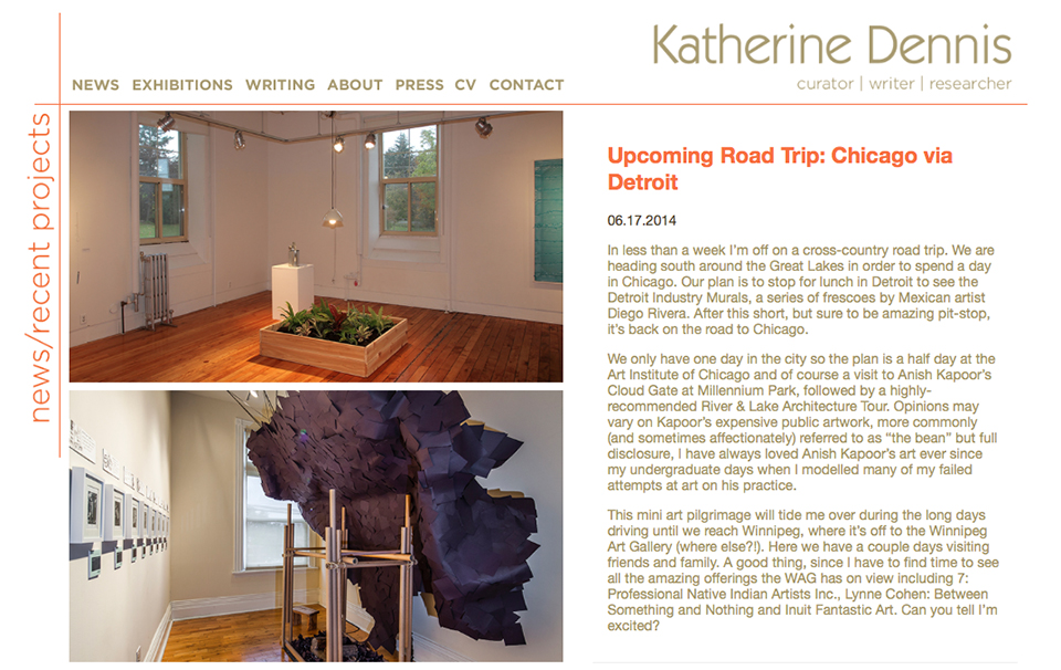
Another interesting aspect of this project was trying to create a simple and user-friendly way for Katherine to add news and updates on her own without having to learn much HTML. To solve this, I devised a plain-text document she could open in Microsoft Excel, make updates, save, and re-upload to the server. The entries you see in the previous and current screen shot show her 'newsfeed' updates to the home page:
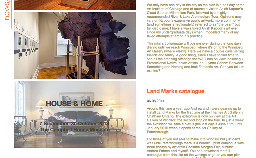
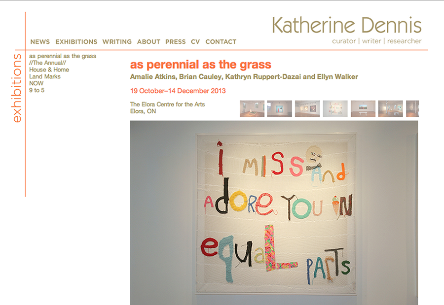
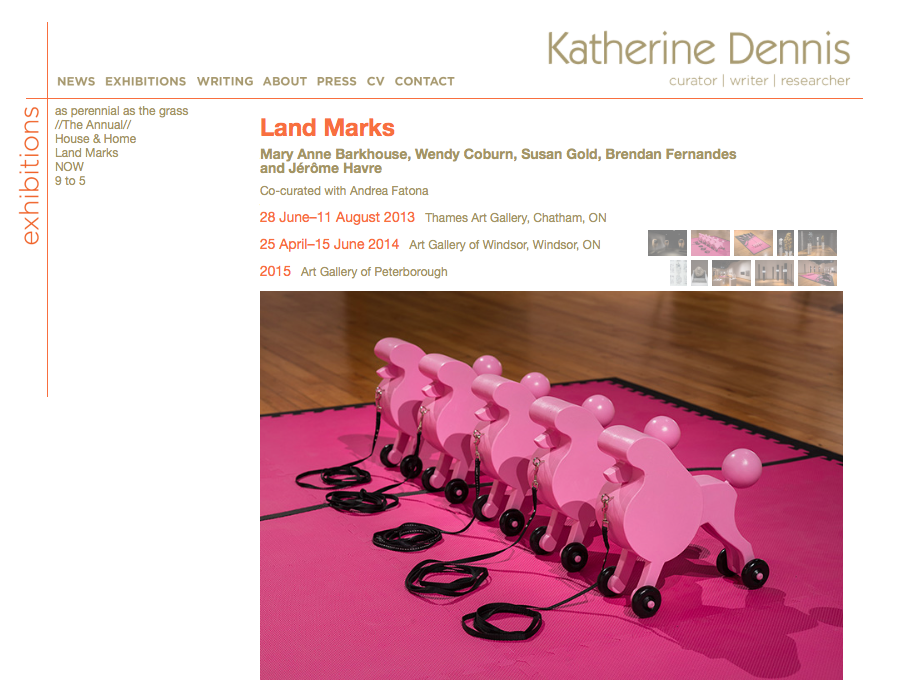
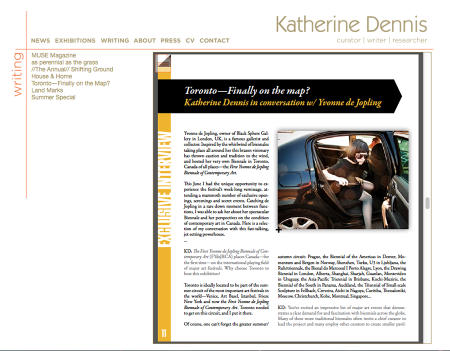
The main component of the site is the exhibitions page, which features a fixed image gallery on top and excerpts of curatorial statments underneath:
This website also incorporated embedded PDFs that included Katherine's writing (in a time when PDF viewing wasn't handled via Google) to increase the usability of digital publications that various galleries and venues were producing to support their programming
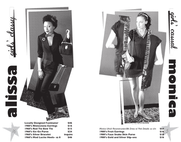
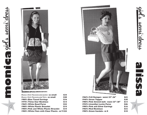
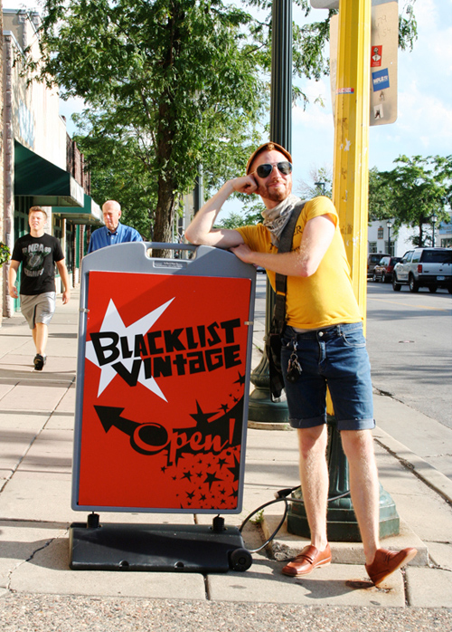
Blacklist Vintage Identity
Year: 2009-10
Client: Blacklist Vintage
Formats: Print & Web-ready graphics, business cards, printed program, interior and exterior signage
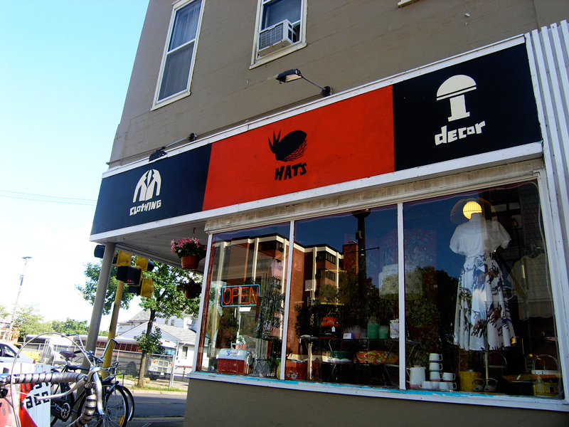
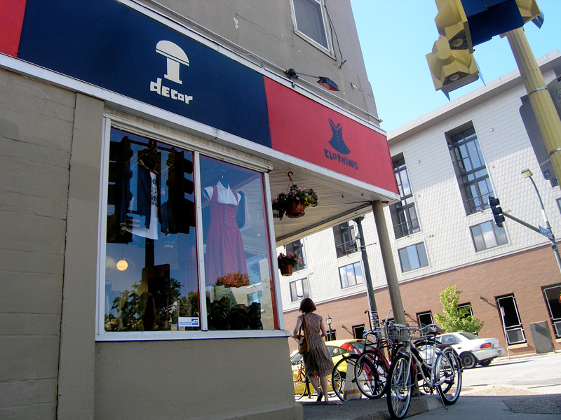
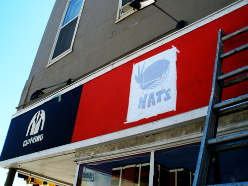
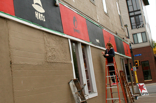
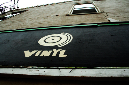
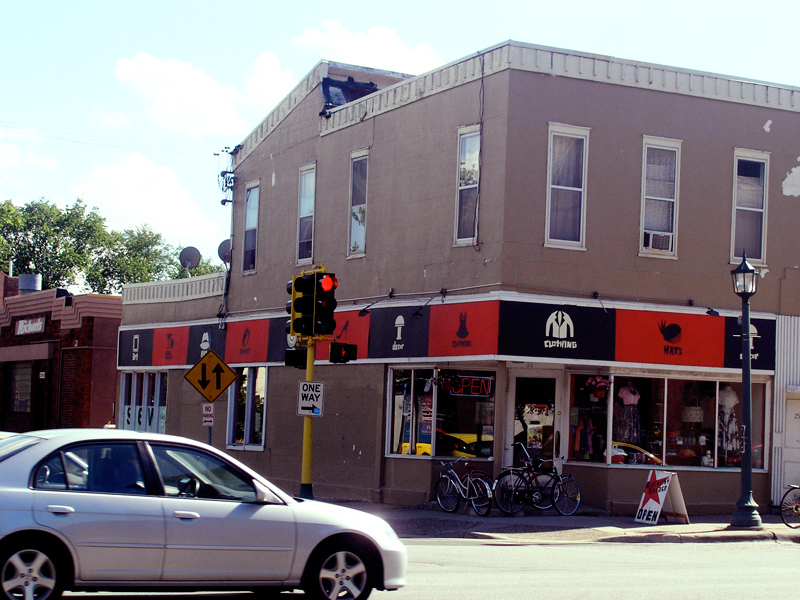
Blacklist Vintage is a locally-owned and renowned hot spot for high-quality vintage clothing and rare finds in Minneapolis, Minnesota. It's situated near Eat Street in the eclectic and trendy Whittier neighbourhood, just south of downtown. When asked to re-do their logo, business cards and website all in the same year, I captialized on the chance to give them a consistent graphic identity. As more projects occurred, the identity grew—including a set of icons representing the shop's different goods. These were eventually hand-painted onto the storefront (documented below).
Finalized, 2-colour logo:
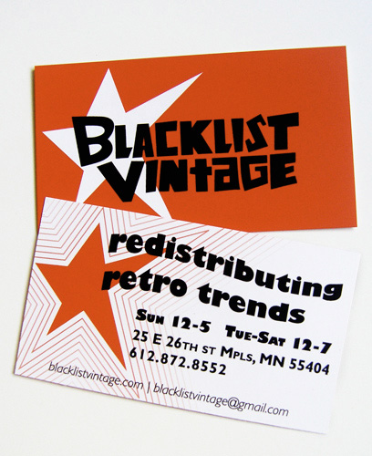
Business card, front and back sides:
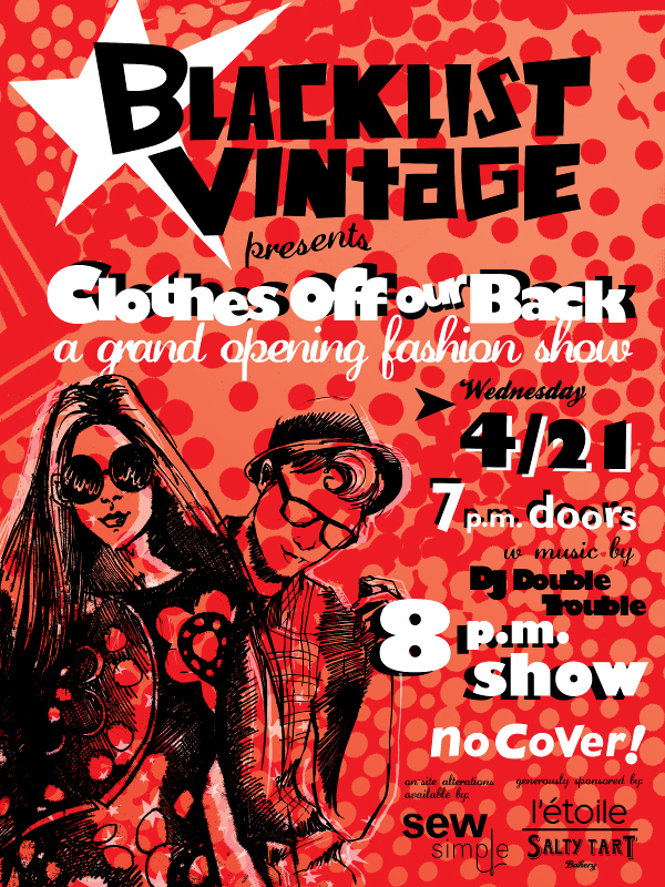
Poster for their Grand Re-Opening, in their new location in 2010:
Lookbook for the Grand Re-Opening fashion show:
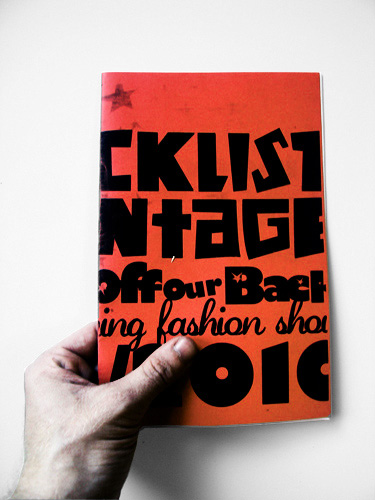
Details of two spreads from the lookbook:
Sidewalk signage:
Multi-purpose set of custom icons and lettering, extrapolated from logotype:
These icons were then hand-painted onto the storefront:
They were transferred using printouts with graphite on the back:
Me painting the storefront:
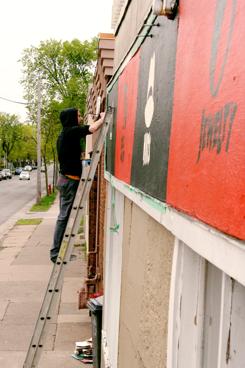
I was assisted by the lovely, talented HMH.
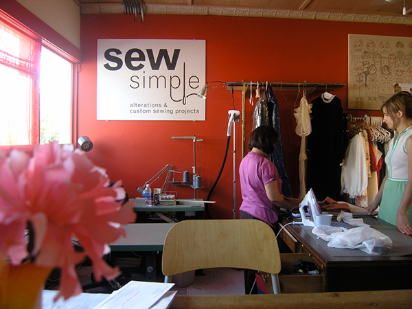
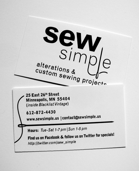
Sew Simple Identity
Year: 2009
Client: Sew Simple
Formats: Print & Web-ready graphics, business cards, interior signage
Sew Simple is family-owned alterations and custom clothing shop in the Whittier neighbourhood of Uptown Minneapolis. At the time that I took on this project, Sew Simple operated in the same building as another client of mine: Blacklist Vintage. This project involved designing a logo, business cards, web graphics and signage for their grand opening. The client made very clear that the objective was to create something clean and simple, but also clever and a bit quirky.
Finalized logo:
Alternate versions of the logo with a spot colour:
Business cards:
Mounted-vinyl signage over the cashwrap: