


Client: KAPSULA Magazine
Location: Toronto, ON
KAPSULA is an online art criticism magazine that meshes an analog and digital publication model. Able to move faster than print pubilcations, the magazine publishes exhibition reviews every two weeks and a montly series of longer critical essays. The logo and identity are meant to convey an uncompromising and bold aesthetic with nods to Constructivism and Soviet era propaganda posters.
Finalized, 2-colour logo:
![]()
Graphic mark (to be used when the logo can't physically fit):

Logo variation for the monthly newsletter:

Online ad for the inaugural issue:

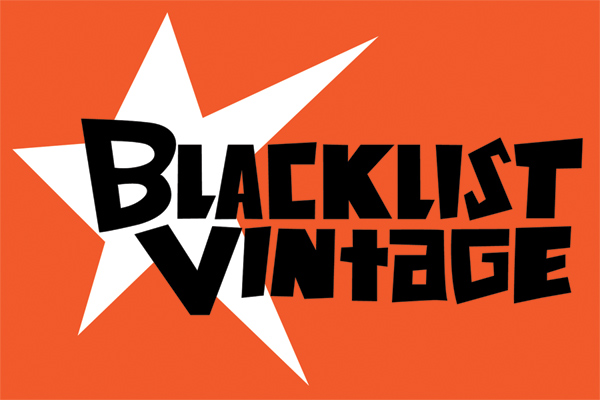
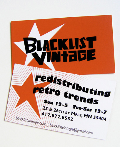
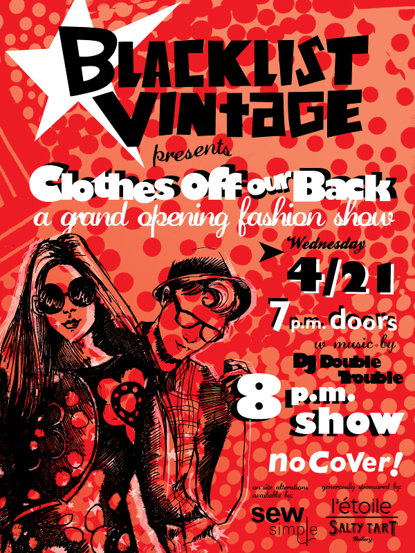
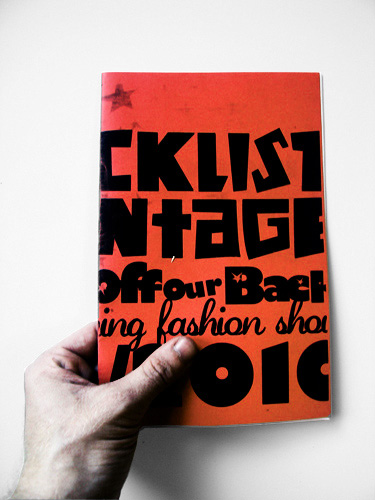
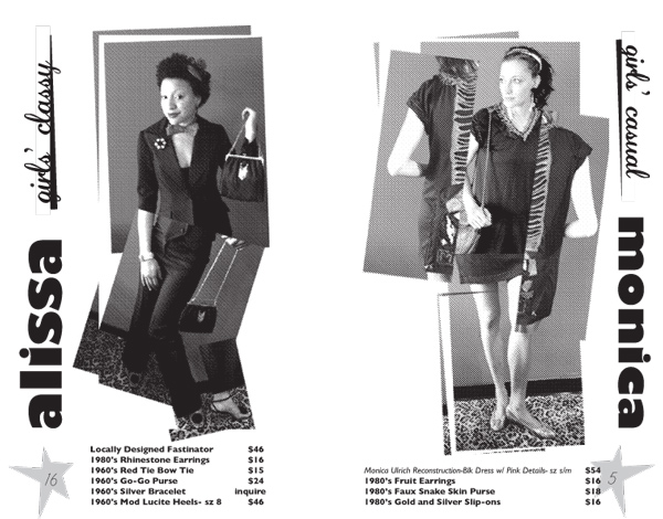
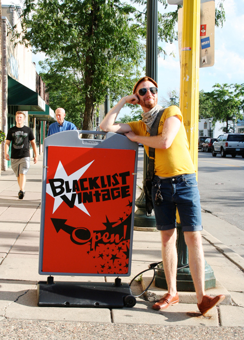
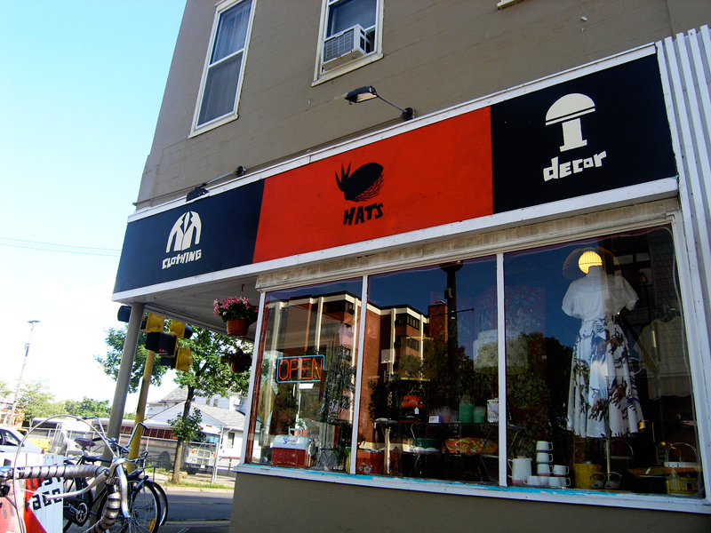
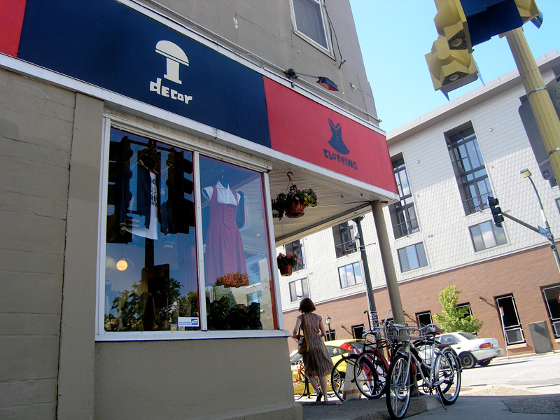
Client: Blacklist Vintage
Location: Minneapolis, MN
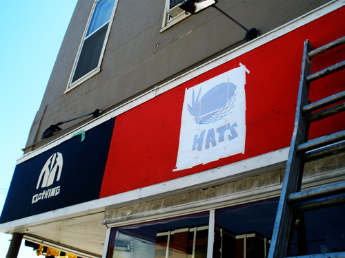
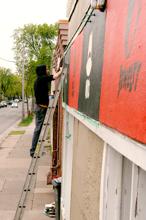
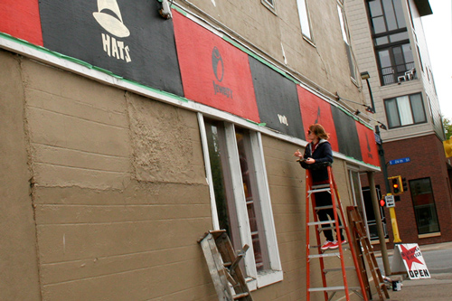
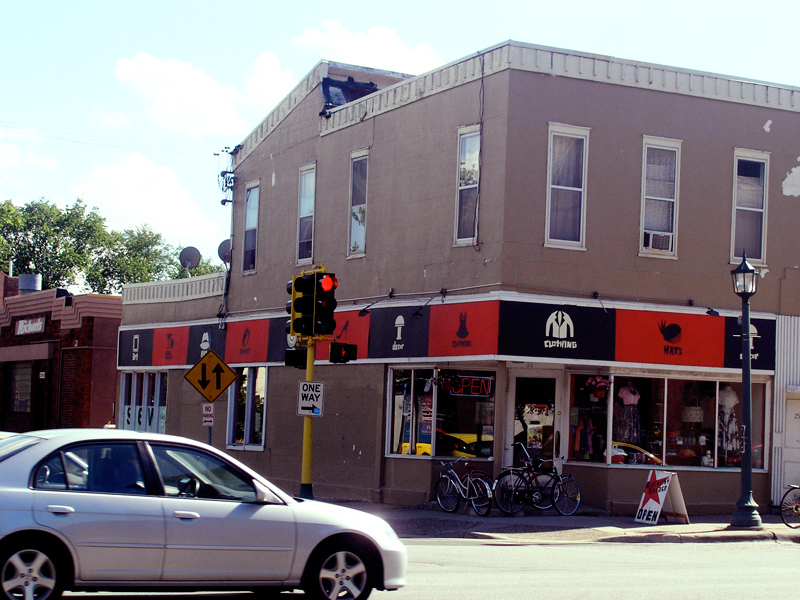
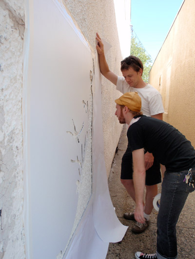
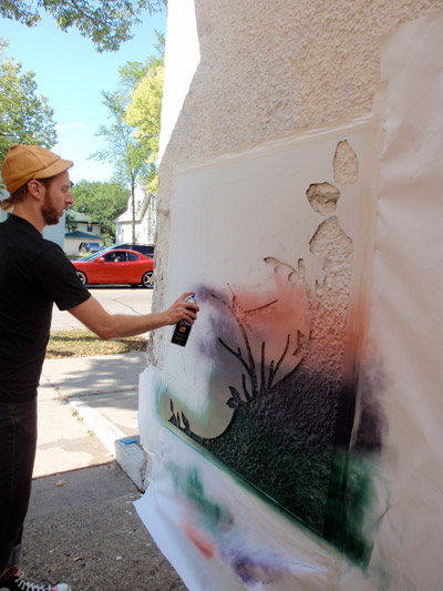
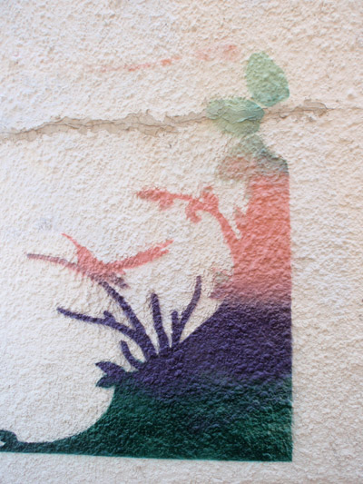
Blacklist Vintage is a locally-owned and renowned hot spot for high-quality vintage clothing and rare finds. It's situated near Eat Street in the eclectic and trendy Whittier neighbourhood, just south of downtown. When asked to re-do their logo, business cards and website all in the same year, I captialized on the chance to give them a consistent graphic identity. As more projects occurred, the identity grew—including a set of icons representing the shop's different goods. These were eventually hand-painted onto the storefront (documented below).
Finalized, 2-colour logo:
Business card, front and back sides:
Poster for their Grand Re-Opening, in their new location in 2010:
Lookbook for the Grand Re-Opening fashion show:
Details of two spreads from the lookbook:
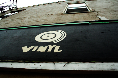
Sidewalk signage:
Multi-purpose set of custom icons and lettering, extrapolated from logotype:
![]()
These icons were then hand-painted onto the storefront:
They were transferred using printouts with graphite on the back:
Me painting:
I was assisted by the lovely, talented HMH:
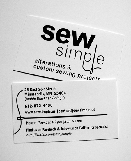
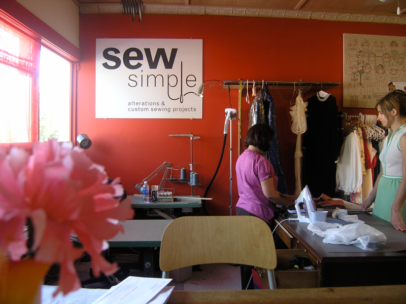
Client: Sew Simple
Location: Minneapolis, MN
Sew Simple is family-owned alterations and custom clothing shop in the Minneapolis Whittier neighbourhood. It shares the same building as another client, Blacklist Vintage. This project involved designing a logo, business cards, web graphics and signage for their grand opening. The client made very clear that the objective was to create something clean and simple, but also clever and a bit quirky.
Finalized logo:
![]()
Versions of the logo with a spot color:
![]()
Business cards:
Mounted-vinyl signage over the cashwrap:
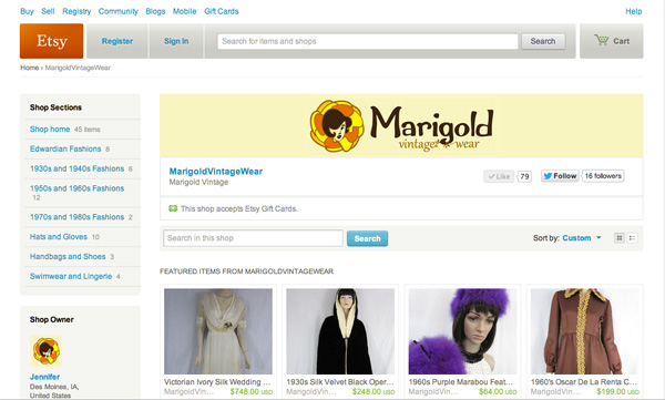
Client: Marigold Vintage Wear
Location: http://www.etsy.com/shop/MarigoldVintageWear
Marigold Vintage Wear is an online vintage clothing store, operating through Etsy.com. This assignment was to do their initial logo and logotype. The request for the design was that I reference art nouveau-era illustrations (where girls' faces are frequently coming out of, or are entwined in, flora) and mix it with a 1960s mod sensibility.
Graphic:

Logotype:

Finalized logo:
![]()
In situ, on the Etsy page:
Client: Susan Hensel Design
Location: Minneapolis, MN
Susan Hensel Design is a studio-based practice that rides the line between art and craft. Specializing in bookmaking, textiles, scultpure and installation, owner Susan Hensel wanted both her material-messiness and her sense of order and balance to come through in the logo. Because her practice has been so centered on principles of storytelling, a book was introduced as a graphic mark and a point of emphasis.
Finalized logo:

Alternate version:

Business cards:

Alternate business card designs:

Client: Corcoran Neighborhood Organization
Location: Minneapolis, MN
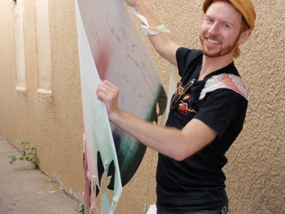
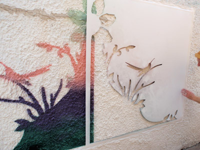
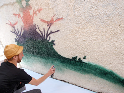
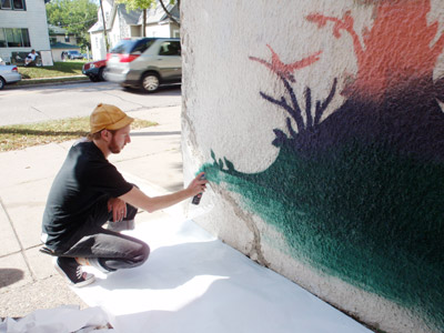
The Corcoran Neighborhood Organization in South Minneapolis was successful in securing grant funding for artists to create anti-graffiti stencil kits that neighborhood residents could use to decorate their property. This is a technique that has proven effective in preventing vandalism in major cities such as Oaxaca, Mexico and Toronto, Canada. I entered a competition and was one of three artists chosen to send my design into production. My stencil was also the one used for prototyping and first experiments in how the graphic would go about being applied by the neighborhood organization.
Initial design:

Me doing the test-run of the stencil outside the organization's headquarters:

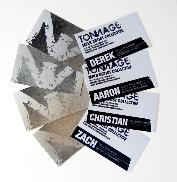
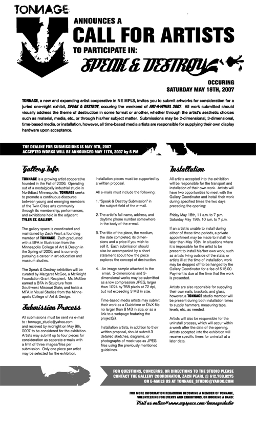
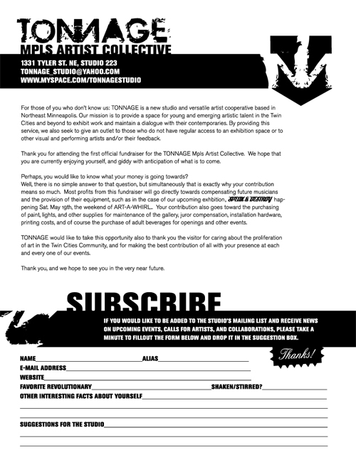
Client: TONNAGE Artist Collective
Location: Minneapolis, MN
TONNAGE was a short-lived but dynamic collective of approximately 12 artists who shared a studio space in an abandoned submarine armory in NE Minneapolis. The design for the logo and general identity was inspired by grunge type and also meant to reference things like anchors, scrap metal and the texture of poured lead, which was telltale of the physical studio space.
Business cards:
Call for submissions:
Subscription form:
Client: Brian Winter
Location: Minneapolis, MN
Brian Winter is an independent songwriter, composer and singer. For his debut album, Taking Flight, he wanted a mixture of photographic textures with crisp and abstract graphics. Many of the songs on the album deal with concepts about heaven or an alternate place, so I wanted to give the whole jacket a surrealistic motif.
CD and insert (folded):

Front and back of CD case:

Website: KAPSULA Magazine
Location: http://kapsula.ca
Kapsula is a listserv publication dedicated to engaged and evaluative art criticism. The website needed to maintain a clean aesthetic due to the nature of the how text heavy it would be. However, it also needed to incorporate bold graphic elements that would anchor that body copy and keep the brand of the magazine consistent throughout each page. The sidebar menu, which has garnered good feedback, was inspired by mid 20th century Russian textbooks that relied on finger tabs to identify chapters.


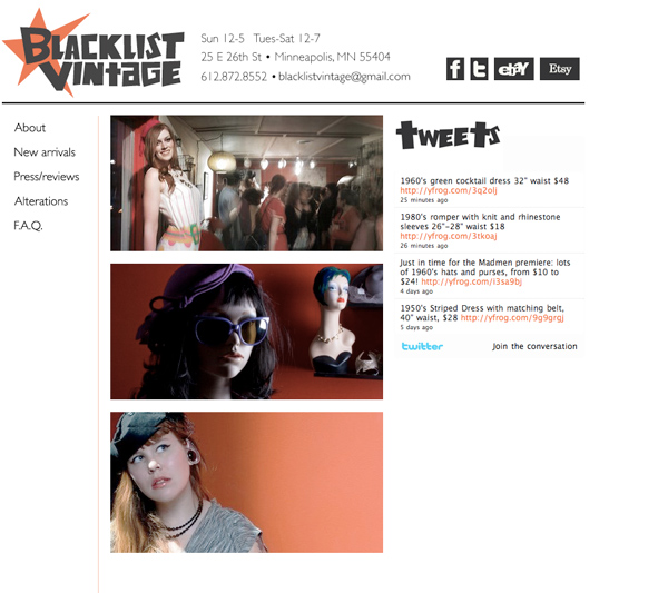
Website: Blacklist Vintage
Location: blacklistvintage.com (taken down early 2012)
Blacklist Vintage is a Minneapolis hot spot for high-quality vintage clothing and rare finds. I was asked to redesign their web presence in early 2010. The site utilized an interactive image gallery on the home page alongside a Twitter feed, which, at the time, was quite progressive for small business. I also integrated a Wordpress blog through some CSS hacks to make it appear as a seamless feed of new inventory items on the New Arrivals page. This was one of my best sites to date—it's a shame they decided to go for a generic Wordpress template two years later.
Website: Katelyn Farstad
Location: katelyn-farstad.com
This is a portfolio site for Katelyn Farstad, a friend and promising emerging artist. Her work is a radical, and sometimes jarring, combination of assemblage and painting that explores personal moments and anecdotes through extreme juxtapositions of various materials, textures and colours. The design of this site is purposefully very minimal, at the request of the artist. PLEASE NOTE: The up-to-date version of the site has a different design for the header than the one pictured below, but I personally like the older version better.


Website: Susan Hensel Design
Location: http://www.susanhenseldesign.com
This is a presentation site for the work of Susan Hensel Design. It was built in my early days of web design, without much CSS knowledge and hardly any Javascript proficiency. Essentially, why I feel this site is still important is that it uses a number of HTML and CSS hacks to work around things that I didn't yet know how to 'properly' execute or achieve. Still, the site functions well, is reliable across browsers and does exactly what it needs to for the client.


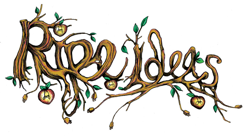
Ripe Ideas
This is a mixture of handtype and digital manipulation in Photoshop. The colour is partly paintbrush tool and partly samples from scanned colored pencil on paper. Lettering was done in ballpoint pen.
Slick Oyster
This is a display-face that I designed for an expressive typography course in my masters. The method behind it was speed and chance. I did multiple experiments and interations using the guiding principle that each letterform needed to be executed in two seconds or under. To introduce an element of chance or chaos, I used the eyedropper of an india ink bottle and tried to manipulate it in a calligraphic fashion.


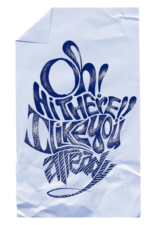
Oh! Hi There!!
Jagged Eyes
This was an exercise for an experimental typography class I was taking during my masters. Each spread in the book is a line in a poem that talks about synthesia. Each type treatment is made of original letterforms and die-cut by hand. Multiple layers are used to create dimensionality and the appearance of 'feeling' type. The backgrounds of the spreads reveal photo documentation of the making of the book.


Songbird
This was originally done for a series of birthday gifts to friends. I printed it out onto heavy cardstock or watercolor paper, and folded it down into an envelope. On the inside would be a 'mixtape' on a CD-R.